This is perhaps the most popular, as well as my personal favorite, post, and I'm sad that I can only do it once every two years (as the IPEDS reporting cycle only requires this data be reported bi-annually.)
This shows patterns of freshman migration within and outside of state boundaries. It's valuable to people because you can see the composition of freshman classes at colleges: Where do the students come from? You can also see patterns of state exports: Which states keep students at home, and which send them out-of-state (of course, the size and educational offerings of the various states means it's often unfair to compare, but it's still interesting.)
For this, I've limited the universe to four-year, public and private, not-for-profit institutions. Community colleges and for-profit colleges tend to have very local enrollment patterns, and high numbers of part-time students. I've also taken out institutions whose primary focus is religious training, as well as those from a few obscure Carnegie categories.
The freshmen in this analysis are only those who graduated within twelve months of enrollment in college. A word of caution: If you are afraid to click buttons and interact, stop now. This won't be of any help to you. You can't break these, and you can always reset using the controls at lower right. So click around and explore the data.
Finally, this shows the data I downloaded. Some of it is pretty clearly wrong, but that's not my problem. Contact the IR office at the offending institution and ask them what they were thinking.
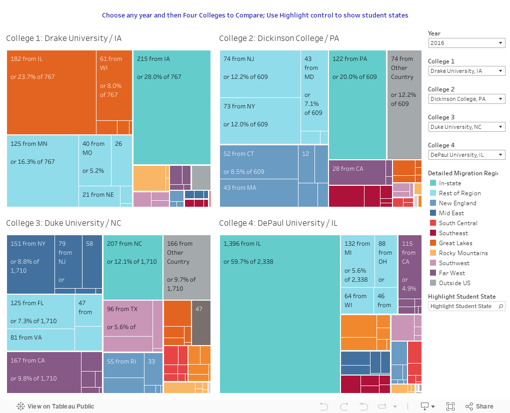
So, first up: If you want to compare any four colleges on the geographic composition of their freshman classes, start here. I've added four colleges that start with "D" but you can use the controls to look at any four you want. Note: Students labeled as "in-region" are from the region, but not the state. Therefore someone "in-region" in a New Hampshire college would be from one of the five other New England states. Got it? Good. Play away on this one:
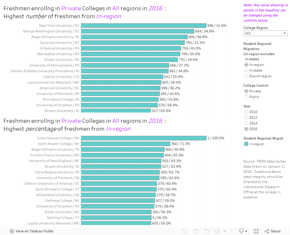
Next up: Looking at the bar charts: It's a little more complex, but you can do it. If you want to see which colleges enroll the most (top chart) or highest percentage (bottom chart) of students from in-state, in-region, or out-of region, this is your visualization. Choose a year (it defaults to 2016), and if you wish, limit it to colleges in a region (The Southeast, for instance). You can limit to public or private as well. Then choose which group of students you want to explore: In-state, in-region, or out-of-region. Again, comparing Texas to Rhode Island should only be done for the "interestingness factor," not to draw conclusions.
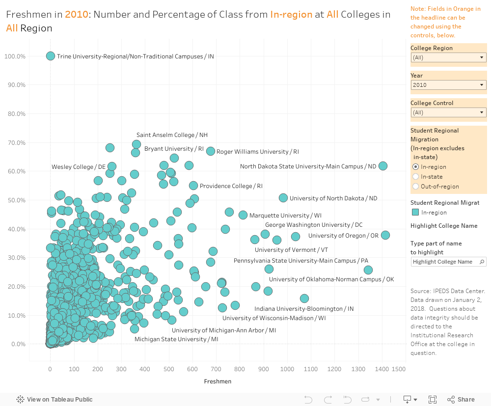
Here is the same data, represented on a scatter plot, in case you want to step back, and see the data all at once. The two scales are the number of freshmen, and the percent from the region selected.
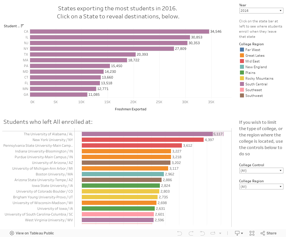
Which states export the most students, and when they export them, where do those students end up? If you've wondered that--or if you're from Illinois or New Jersey and lament our students' mobility--this is the visualization for you.
Choose a year, and see (on the top bars, in purpley-mauve) which states exported the most students. Then, click on a bar representing a state to see where students from that state enrolled, in the bottom chart. If you want the college destinations to be limited to public or private, or a certain region, you can use those controls to do so.
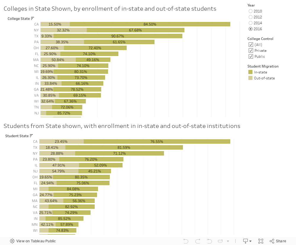
And finally, if you're interested in which states keep students at home, you can see that, too, on this visualization. The top view looks at colleges in a state, and where their students come from; the bottom looks at students from that state, and whether they go out-of-state or stay in-state. Again, choose a year or institutional type, if you want to look at colleges or students going to those types of colleges.
I hope you have enjoyed looking at this data as much as I have enjoyed playing with it. If you spot any errors that I've made (Tableau still has no spell check....) let me know, and I'll get to fixing them right away. Otherwise, leave a comment below with questions or observations.
This shows patterns of freshman migration within and outside of state boundaries. It's valuable to people because you can see the composition of freshman classes at colleges: Where do the students come from? You can also see patterns of state exports: Which states keep students at home, and which send them out-of-state (of course, the size and educational offerings of the various states means it's often unfair to compare, but it's still interesting.)
For this, I've limited the universe to four-year, public and private, not-for-profit institutions. Community colleges and for-profit colleges tend to have very local enrollment patterns, and high numbers of part-time students. I've also taken out institutions whose primary focus is religious training, as well as those from a few obscure Carnegie categories.
The freshmen in this analysis are only those who graduated within twelve months of enrollment in college. A word of caution: If you are afraid to click buttons and interact, stop now. This won't be of any help to you. You can't break these, and you can always reset using the controls at lower right. So click around and explore the data.
Finally, this shows the data I downloaded. Some of it is pretty clearly wrong, but that's not my problem. Contact the IR office at the offending institution and ask them what they were thinking.
So, first up: If you want to compare any four colleges on the geographic composition of their freshman classes, start here. I've added four colleges that start with "D" but you can use the controls to look at any four you want. Note: Students labeled as "in-region" are from the region, but not the state. Therefore someone "in-region" in a New Hampshire college would be from one of the five other New England states. Got it? Good. Play away on this one:
Next up: Looking at the bar charts: It's a little more complex, but you can do it. If you want to see which colleges enroll the most (top chart) or highest percentage (bottom chart) of students from in-state, in-region, or out-of region, this is your visualization. Choose a year (it defaults to 2016), and if you wish, limit it to colleges in a region (The Southeast, for instance). You can limit to public or private as well. Then choose which group of students you want to explore: In-state, in-region, or out-of-region. Again, comparing Texas to Rhode Island should only be done for the "interestingness factor," not to draw conclusions.
Here is the same data, represented on a scatter plot, in case you want to step back, and see the data all at once. The two scales are the number of freshmen, and the percent from the region selected.
Which states export the most students, and when they export them, where do those students end up? If you've wondered that--or if you're from Illinois or New Jersey and lament our students' mobility--this is the visualization for you.
Choose a year, and see (on the top bars, in purpley-mauve) which states exported the most students. Then, click on a bar representing a state to see where students from that state enrolled, in the bottom chart. If you want the college destinations to be limited to public or private, or a certain region, you can use those controls to do so.
And finally, if you're interested in which states keep students at home, you can see that, too, on this visualization. The top view looks at colleges in a state, and where their students come from; the bottom looks at students from that state, and whether they go out-of-state or stay in-state. Again, choose a year or institutional type, if you want to look at colleges or students going to those types of colleges.
I hope you have enjoyed looking at this data as much as I have enjoyed playing with it. If you spot any errors that I've made (Tableau still has no spell check....) let me know, and I'll get to fixing them right away. Otherwise, leave a comment below with questions or observations.
Comments
Post a Comment