This post started off simply enough: I found some cool data on changes in educational attainment over time. I was going to take a look at how far we'd come as a nation in the last 40 years (even though I had already published this), and show where the biggest gains were.
It wasn't very compelling, at least at first.
Then, I decided to get ambitious (my wife was in her evening class, so I had the night free), and wondered if there were any interesting connections between changes in educational attainment and voting patterns in 2016. I found a data set with election results by county, (a handful of counties are missing) and merged it in. And thus, this.
Before I start, there are a few points to make about the data. First, the definitions changed slightly over time. For instance, in 1970, the field is labeled "College degree," while in 2010, it's labeled "Four or more years of college." Not the same thing, but we'll have to go with it for now. Also, 2010 is not really 2010; it's the data from the five year American Community Survey of the Census Bureau, but there's no reason to believe it's not as accurate as the census itself. In fact, the ACS is used to test the accuracy of the census.
So, onward.
Using the tabs across the top of the visualization:
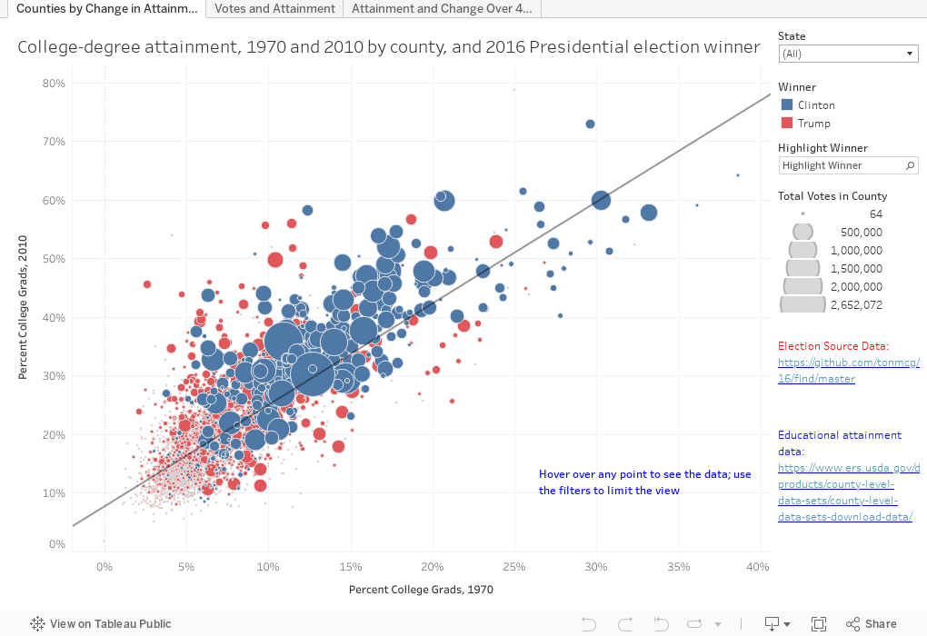
First, a scattergram, plotting attainment in 1970 and 2010. The regression line suggests that attainment has essentially doubled in 40 years; those bubbles (counties) above it have done better; those below worse. Bubbles are sized by votes in the county in the 2016 presidential election. If you want to look at just one candidate, use the highlighter function.
Note that the counties that went for Clinton tend to be larger (more urban), with higher levels of attainment (moving toward the top right) and more above the line. Counties that went for Trump tend to be the opposite. And of course, there are many exceptions (Johnson County, Kansas; Apache County, Arizona), and clearly the binary blue/red can be misleading; some victories are by a point, some by 15 points or more. Finally, it's almost certain that much of the change in attainment is due to people moving in and out; not everyone lives where they were born. But it's still interesting.
Second, the bar chart (I know from experience that many people won't click on the second tab. Please. You will be glad you did). The x-axis is broken into college degree attainment. For instance, the long bars in the center show counties where 30--34.99% of adults have a college degree. You can see how many votes these counties cast for Trump, and how many for Clinton. I double checked this; it is perhaps the best story I've ever told with one chart. And although the left end changes as you select single states (using the filter at the top), the right end is fairly stable.
Finally, the last chart just shows three variables: 1970 and 2010 college-degree attainment, and the change over time. See the box to the right of the chart if you want to sort the data.
Admittedly, this election was a strange one, so perhaps there are no lessons to be learned. But over the past few decades, Republicans have been fairly staunch opponents of increased educational funding, and you have to wonder if this doesn't explain why; people who lived in areas with higher levels of education voted for Democrats in the last election.
Fifty years ago, the Republicans were the party of the college-educated, white collar classes; the Democrats the blue collar, working-class, high school educated citizens. That's all changed, if 2016 is any indication.
Agree? Disagree? Let me know in the comments below.
It wasn't very compelling, at least at first.
Then, I decided to get ambitious (my wife was in her evening class, so I had the night free), and wondered if there were any interesting connections between changes in educational attainment and voting patterns in 2016. I found a data set with election results by county, (a handful of counties are missing) and merged it in. And thus, this.
Before I start, there are a few points to make about the data. First, the definitions changed slightly over time. For instance, in 1970, the field is labeled "College degree," while in 2010, it's labeled "Four or more years of college." Not the same thing, but we'll have to go with it for now. Also, 2010 is not really 2010; it's the data from the five year American Community Survey of the Census Bureau, but there's no reason to believe it's not as accurate as the census itself. In fact, the ACS is used to test the accuracy of the census.
So, onward.
Using the tabs across the top of the visualization:
First, a scattergram, plotting attainment in 1970 and 2010. The regression line suggests that attainment has essentially doubled in 40 years; those bubbles (counties) above it have done better; those below worse. Bubbles are sized by votes in the county in the 2016 presidential election. If you want to look at just one candidate, use the highlighter function.
Note that the counties that went for Clinton tend to be larger (more urban), with higher levels of attainment (moving toward the top right) and more above the line. Counties that went for Trump tend to be the opposite. And of course, there are many exceptions (Johnson County, Kansas; Apache County, Arizona), and clearly the binary blue/red can be misleading; some victories are by a point, some by 15 points or more. Finally, it's almost certain that much of the change in attainment is due to people moving in and out; not everyone lives where they were born. But it's still interesting.
Second, the bar chart (I know from experience that many people won't click on the second tab. Please. You will be glad you did). The x-axis is broken into college degree attainment. For instance, the long bars in the center show counties where 30--34.99% of adults have a college degree. You can see how many votes these counties cast for Trump, and how many for Clinton. I double checked this; it is perhaps the best story I've ever told with one chart. And although the left end changes as you select single states (using the filter at the top), the right end is fairly stable.
Finally, the last chart just shows three variables: 1970 and 2010 college-degree attainment, and the change over time. See the box to the right of the chart if you want to sort the data.
Admittedly, this election was a strange one, so perhaps there are no lessons to be learned. But over the past few decades, Republicans have been fairly staunch opponents of increased educational funding, and you have to wonder if this doesn't explain why; people who lived in areas with higher levels of education voted for Democrats in the last election.
Fifty years ago, the Republicans were the party of the college-educated, white collar classes; the Democrats the blue collar, working-class, high school educated citizens. That's all changed, if 2016 is any indication.
Agree? Disagree? Let me know in the comments below.
Comments
Post a Comment